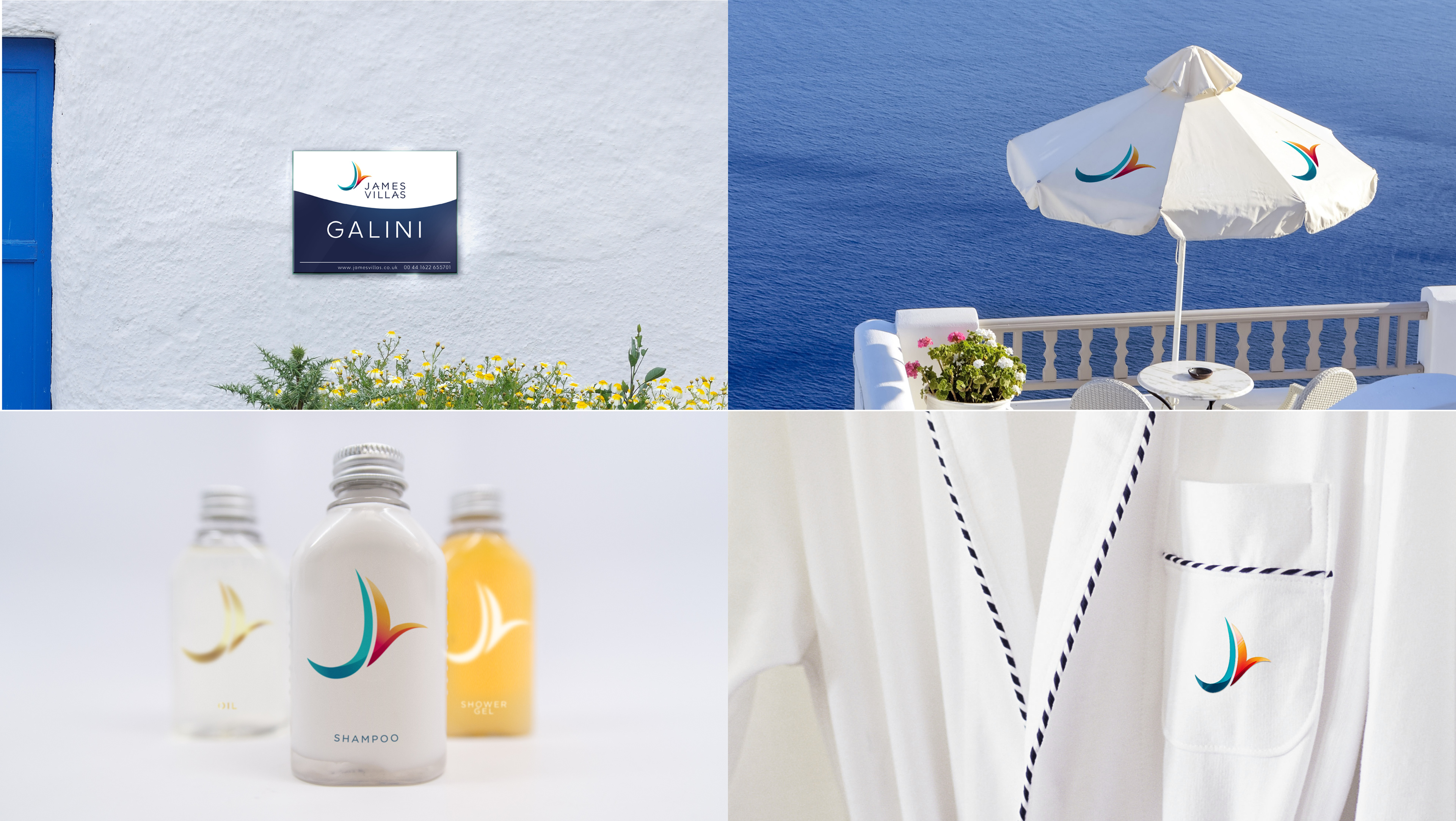
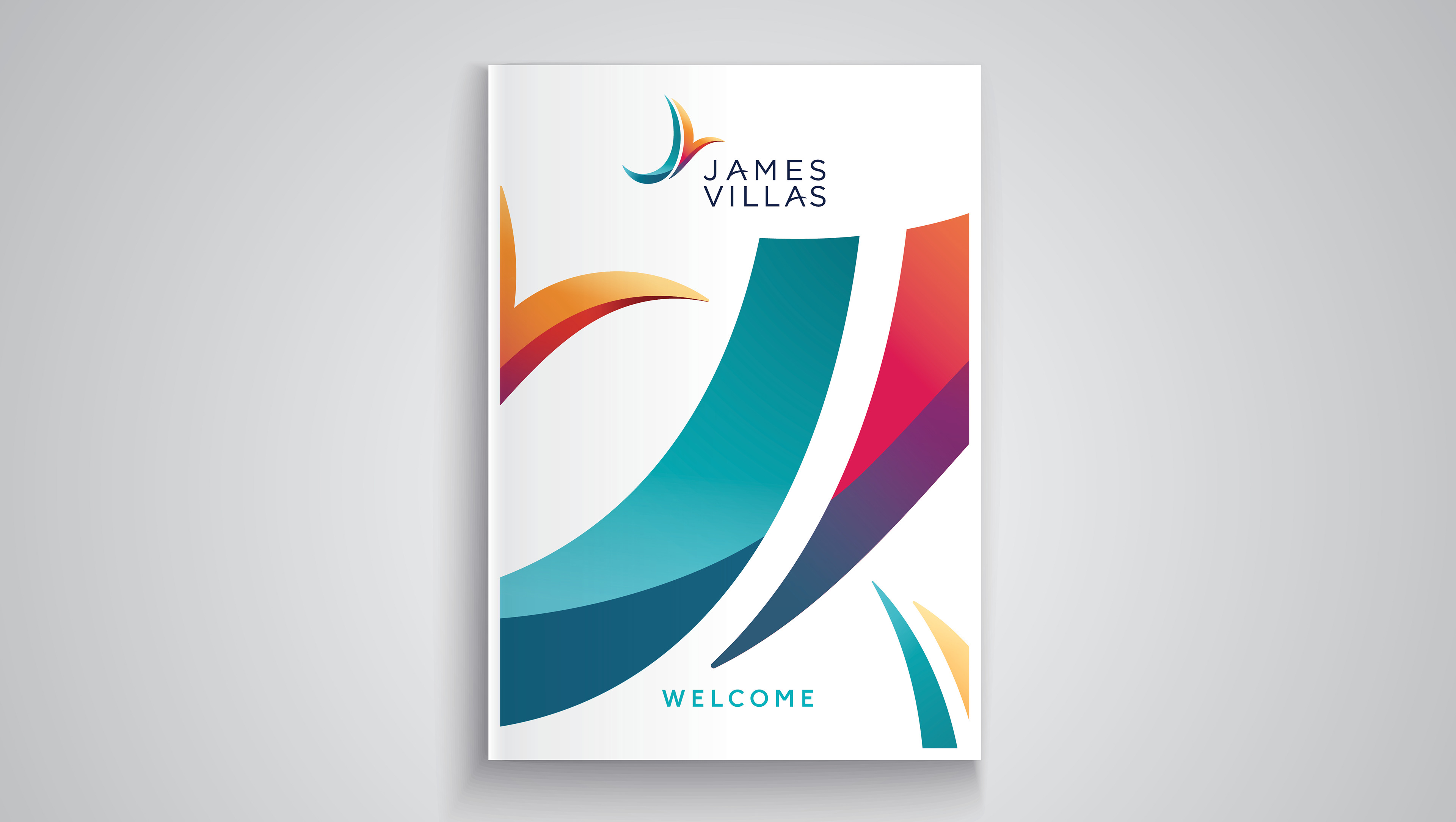
This brand refresh was long overdue. We looked to not only modernise the brand and help it stand out in the market, as well as push its premium offering, but most importantly to also give the brand meaning.
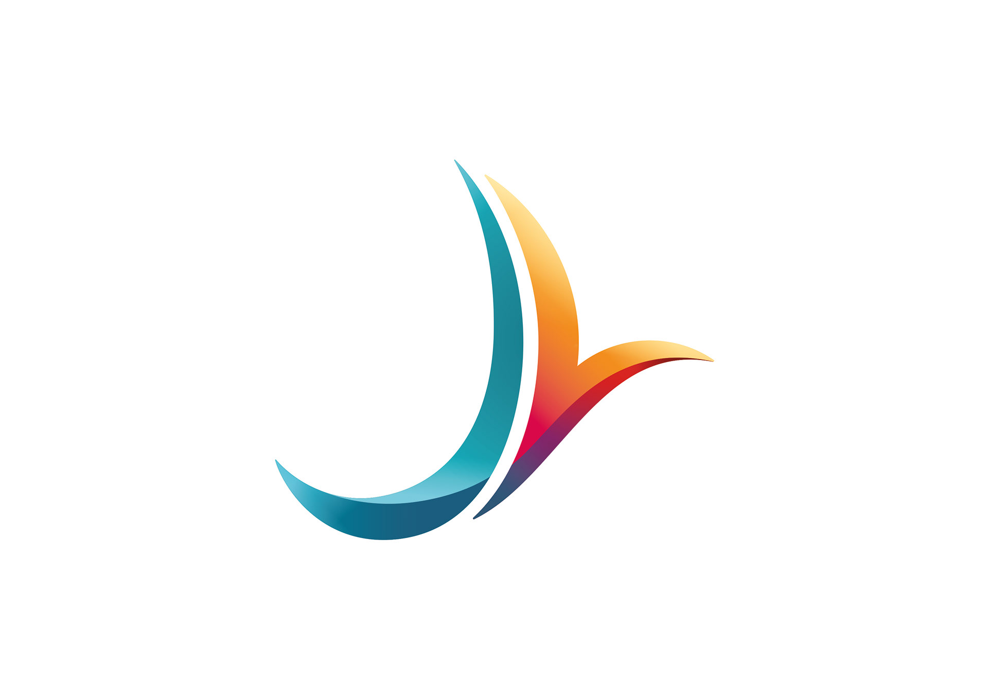
We found that the key thing people wanted from their holidays was freedom – from work, routine, from the day-to-day. We wanted to capture that freedom and symbolise it – and the perfect manifestation of that was in a soaring bird.
So we took the J and V and gracefully crafted them together to create this as the mark of the brand. The freedom bird.


